ShopDreamUp AI ArtDreamUp
Deviation Actions


Suggested Deviants


Suggested Collections


Description
New Version [link]
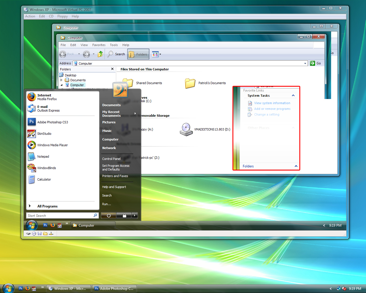
Finally the BETA.
Sorry folks, didn't realize WearoB was improperly packaged. It is now inside of a ".RAR file" When extracted is a ".WBA file".
In the version, The Window Frames are mine. From what i see they are almost perfect. With help of "fediafedia"
This version also include a MUCH better start menu, not all kinks are out yet. The fonts of the taskbar are very very close to vista, and of window frames.
Please leave comments, idea's or any bugs you may find.
Edit: Big change to window frames. Thanks to fediafedia for vista sizing and for reminding me that there is an active and inactive. Also fixed Sizing problems on different resolutions.
Changed the positions of the close, restore,....ect. now more like vista.
© 2008 - 2024 M-2The-O-Squared
Comments20
Join the community to add your comment. Already a deviant? Log In
Needs lots of work in quite a few areas. Keep at it.